The Bibles of
The Poor
Marshall McLuhan
The result was a lucrative black-market trade, and secret maps were widely sold. The sort of maps in question had nothing in common with those of later design, being in fact more like diaries of different adventures and experiences. For the later perception of space as uniform and continuous was unknown to the medieval cartographer, whose efforts resembled modern nonobjective art.
The shock of the new Renaissance space is still felt by natives who encounter it today for the first time. Prince Modupe tells in his autobiography, I Was a Savage, how he had learned to read maps at school, and how he had taken back home to his village a map of a river his father had traveled for years as a trader.
My father thought the whole idea was absurd. He refused to identify the stream he had crossed at Bomako, where it is no deeper, he said, than a man is high, with the great widespread waters of the vast Niger delta. Distances as measured in miles had no meaning for him....
Maps are liars, he told me briefly. From his tone of voice I could tell that I had offended him in some way not known to me at the time. The things that hurt one do not show on a map. The truth of a place is in the joy and the hurt that come from it. I had best not put my trust in anything as inadequate as a map, he counseled.
I understand now, although I did not at the time, that my airy and easy sweep of map-traced staggering distances belittled the journeys he had measured on tired feet. With my big map-talk, I had effaced the magnitude of his cargo-laden, heat-weighted treks.
All the words in the world cannot describe an object like a bucket, although it is possible to tell in a few words how to make a bucket. This inadequacy of words to convey visual information about objects was an effectual block to the development of the Greek and Roman sciences. Pliny the Elder reported the inability of the Greek and Latin botanists to devise a means of transmitting information about plants and flowers:
Hence it is that other writers have confined themselves to a verbal description of the plants; indeed some of them have not so much as described them even, but have contented themselves for the most part with a bare recital of their names.
We are confronted here once more with that basic function of media --- to store and to expedite information. Plainly, to store is to expedite, since what is stored is also more accessible than what has to be gathered. The fact that visual information about flowers and plants cannot be stored verbally also points to the fact that science in the Western world has long been dependent on the visual factor.
Nor is this surprising in a literate culture based on the technology of the alphabet, one that reduces even spoken language to a visual mode. As electricity has created multiple non-visual means of storing and retrieving information, not only culture but science also has shifted its entire base and character. For the educator, as well as the philosopher, exact knowledge of what this shift means for learning and the mental process is not necessary.
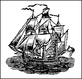
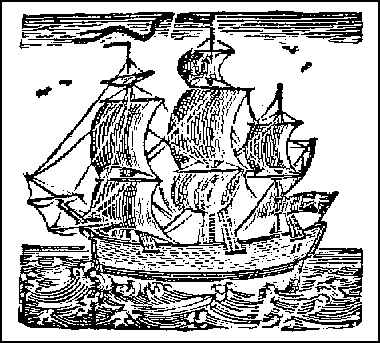
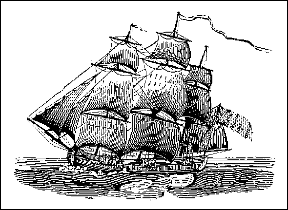
Well before Gutenberg's development of printing from movable types, a great deal of printing on paper by woodcut had been done. Perhaps the most popular form of this kind of block printing of text and image had been in the form of the Biblia Pauperum, or "Bibles of the Poor." Printers in this woodcut sense preceded typographic printers, though by just how long a period it is not easy to establish, because these cheap and popular prints --- despised by the learned --- were not preserved any more than are the comic books of today. The great law of bibliography comes into play in this matter of the printing that precedes Gutenberg: The more there were, the fewer there are. It applies to many items besides printed matter --- to the postage stamp and to the early forms of radio receiving sets.
 Medieval and Renaissance man experienced little of the separation and specialty among the arts that developed later. The manuscript and the earlier printed books were read aloud, and poetry was sung or intoned. Oratory, music, literature, and drawing were closely related. Above all, the world of the illuminated manuscript was one in which lettering itself was given plastic stress to an almost sculptural degree.
In a study of the art of Andrea Mantegna, the illuminator of manuscripts, Millard Meiss mentions that, amidst the flowery and leafy margins of the page, Mantegna's letters
rise like monuments, stony, stable and finely cut. Palpably soled and weighty, they stand boldly before the colored ground, upon which they often throw a shadow.
The same feeling for the letters of the alphabet as engraved icons has returned in our own day in the graphic arts and in advertising display. Perhaps the reader will have encountered the sense of this coming change in Rimbaud's sonnet on the vowels, or in some of Braque's paintings. But ordinary newspaper headline style tends to push letters toward the iconic form, a form that is very near to auditory resonance, as it is also to tactile and sculptural quality.
Perhaps the supreme quality of the print is one that is lost on us, since it has so casual and obvious an existence. It is simply that it is a pictorial statement that can be repeated precisely and indefinitely --- at least as long as the printing surface lasts. Repeatability is the core of the mechanical principle that has dominated our world, especially since the Gutenberg technology. The message of the print and of typography is primarily that of repeatability.
With typography, the principle of movable type introduced the means of mechanizing any handicraft by the process of segmenting and fragmenting an integral action. What had begun with the alphabet as a separation of the multiple gestures and sights and sounds in the spoken word, reached a new level of intensity, first with the woodcut and then with typography. The alphabet left the visual component as supreme in the word, reducing all other sensuous facts of the spoken word to this form.
This helps to explain why the woodcut, and even the photograph, were so eagerly welcomed in a literate world. These forms provide a world of inclusive gesture and dramatic posture that necessarily is omitted in the written word.
The print was eagerly seized upon as a means of imparting information, as well as an incentive to piety and meditation. In 1472 the Art of War by Volturius was printed at Verona, with many woodcuts to explain the machinery of war. But the uses of the woodcut as an aid to contemplation in Books of Hours, Emblems, and Shepherds' Calendars continued for two hundred years on a large scale.
It is relevant to consider that the old prints and woodcuts, like the modern comic strip and comic book, provide very little data about any particular moment in time, or aspect in space, of an object. The viewer, or reader, is compelled to participate in completing and interpreting the few hints provided by the bound- ing lines. Not unlike the character of the woodcut and the cartoon is the TV image, with its very low degree of data about objects, and the resulting high degree of participation by the viewer in order to complete what is only hinted at in the mosaic mesh of dots. Since the advent of TV, the comic book has gone into a decline.
It is, perhaps, obvious enough that if a cool medium involves the viewer a great deal, a hot medium will not. It may contradict popular ideas to say that typography as a hot medium involves the reader much less than did manuscript, or to point out that the comic book and TV as cool media involve the user, as maker and participant, a great deal.
©1964, McGraw-Hill Book Co.