Judge This
Chip Kidd
(TED/Simon & Schuster)

Kidd is a professional book designer. He has, in his many years in the business, created book-covers for works by Jay McInerney, James Ellroy, William Boyd, Shuichi Yoshida, David Sedaris and Haruki Mirakami.Some of his designs are definitely witty: Oliver Sacks' The Mind's Eye in which the lettering appears to be washing away. Others come off as arch: David Rakoff's Fraud --- the word scrawled across the cover in red, with a flat red line underneath.
Some appear as we might expect: Robert Hughes; Rome is complete with a fragment of worn statuary from 2500 years ago. Some may create another feeling entirely like Kidd's cover for Mary Roach's Gulp which might be seen as slightly revolting: a wide (wide!) open mouth, complete with fourteen foreshortened teeth, a lasciviously long protruding tongue, and a glistening, droopy uvula.
For one thing, it isn't all that original. The Rolling Stones had been bored by designs created for their records from Decca, so Mick Jagger approached the Royal College of Art in London in 1969, found a student to do a design based on those very famous and slightly garish lips of his, and the result became an instant hit.
Kidd, not content with this obnoxious book-cover yawn-glob for Gulp offers, on a previous page, a head-shot of his own face --- presumably taken at some ungodly hour of the morning --- eyes bulgy, tongue out, half-beard grown in. All fairly nausea-inducing, as morning mouths usually are.
He also brings us here designs by others that he feels convey the prime message that an advertiser might want to get across to sell something. He cites the new Diet Coke can, says it is "mysterious in the best possible way," an embodiment of the philosophy of "less is more." He also likes countdown numbers at the pedestrian crossings in New York City ("take all the guesswork out of deciding whether to try to beat the light or cool your heels at the curb.") And he does not limit himself to motifs of today. There is an amusing plastic iron --- an iron, that is, used to press clothes --- manufactured in 1945 by Pyrex/Corning. It is a nice but unlikely item, appearing in five colors, all of glass.
Other things he likes: carrot cakes with a mold of a shaped carrot on top, complete with green crown, being a pictorial representation to remind you what's going on inside of it (and, ultimately, will be inside of you). He also likes the dollar bill with its "two green tones (soothing, reassuring, earthy), the precise engraving and stamping, the texture of the resilient cotton and linen paper in the hand."
This is great graphic design that hundreds of millions of people interact with every day.
He also offers examples of the everyday that he thinks might be sending a contradictory message. There is a smushed and dirty Marlboro package, probably found in some gutter, but "the design even holds up when it's crushed and stomped into the street, because the typography is classic, the colors are pure, and the proportions are balanced."
Then there is that singular image that all of us instinctively despise. Which might be the case because it is so perversely complicated: one look at it, the eyes glaze over, and we know we are in for trouble. It's the IRS Form 1040, "U. S. Individual Tax Return" which, on its first page alone, sports some thirty-seven blanks for us to fill in.
To the poor working stiffs, the very sight of it must be enough to bring up breakfast again, knowing that the cards are stacked against them and all the wage-earners of America. With this cluttered, barely readable form, they know that, when finished filling it out and shipping it off, they'll be shipping off a goodly part of their income too.
It's this knowledge that they are getting officially screwed, daily, by a government that can't seem to resist a double screwing where it hurts the most. For we all now know that those who are rich will be taken care of by the representatives that they've bought to be their public servants in Congress. Their taxes will be minimal. The rest of us can stuff it. As Warren Buffet once explained, in a small survey of his office staff there in his Berkshire Hathaway empire, he discovered that he was "paying 17.7% payroll and income tax, compared with an average in the office of 32.9%."
There wasn't anyone in the office, from the receptionist up, who paid as low a tax rate and I have no tax planning; I don't have an accountant or use tax shelters. I just follow what the US Congress tells me to do.
Kidd also uses the space in this book to give us other opinions, some of which may find us on our knees, chanting "Amen!" One is the reminder of the massacre of Penn Station, the one-time masterpiece of the Beaux-Arts style, one of the architectural jewels of New York City.
The brains behind that wanton destruction of 1962 was one Irving M. Felt, president of Graham-Paige Co. He purchased the air rights prior to the leveling of the building, and to prove his status as the prime nitwitish representative of the mercantile class, he announced that "the gain from the new buildings and sports center would more than offset any aesthetic loss."
Kidd reports, "In what appears to be a cruel joke, there are photos mounted on the gate pillars showing how spectacular the original vaulted Beaux Arts building used to be."
Thanks a lot. But the mystery here is not only why it is so ugly, but how difficult it is to navigate through.
Although Kidd is right on, on occasion, we must never forget that he is also a salesman. He wants to attract your attention so he can sell you something. In this case, what he wants to sell you is a book. Which is, in truth, a small, not inexpensive ($16.99) commercial for Chip Kidd, revealing to us what a clever designer he is.Of the less than fifty full-page photographs here, sixteen are of the covers he's produced for Sedaris, Sacks, Roach et al, not including his personal gummy early-morning mug-shot. There is, too, a security badge with his name on it, chop sticks "which I use to eat at my desk," and him scowling next to a diet coke placard that, he claims, compares using Coke to using dope, viz. "You're on Coke."
The inside joke, not mentioned by him, is that Coca-Cola was named in 1885 for its two "medicinal" ingredients: extract of coca leaves and kola nuts. According to "Urban Legends," it only came to be completely free of the drug in 1929.
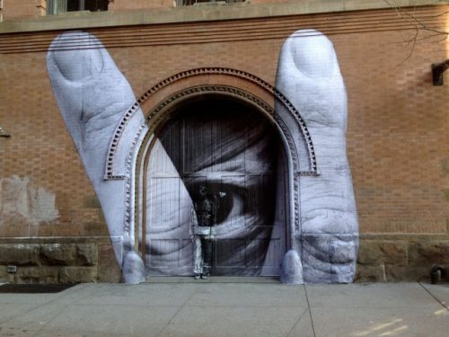
Some others of Chip Kidd's pet peeves, like his distaste for grafitti, seem perverse merely to be perverse. He does not see grafitti for what it can be --- the voice of those who cannot pay for air time on radio or television, buy space in the newspaper or in magazines, may not even know how to use the internet, cannot afford to put out a book (especially one decorated by him) to convey what they feel to be an important memorandum to the world-at-large.To reach their audience, grafitti artists must depend on unused visual space (trucks or trains or buses, streets or sidewalks, whole sides of buildings) to offer their opinions, thoughts, and feelings to the world.
Says Kidd. "It makes me feel that anarchy has taken over. This is not a good thing, trust me (East Berlin, anyone?)" Right: those who fill these blank spaces with drawings, paintings, or lettering must be proto-hard-line (think East Berlin!) Communists . . . with the added touch of the dreadful Bakunin.
Which ignores the fact that the blank walls of a condo or warehouse or cheap apartment complex can be the essence of uglification of form: an exposed gray concrete blank which, for some of us, begs to beget color and light and life.
Let some of the images shown here with this review offer a counterbalance to Kidd's personal bile for the originality that was born with a paint-spray can, somewhere there on the streets of the poor and dispossessed.